Shape
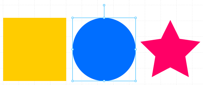
Used to display a geometric shape that can be combined visually with other Components to create custom symbols, a custom background, visual containers, or even simple drawings.
Properties
| Property | Type | Description |
|---|---|---|
| Options | Shape Options | Configuration that controls the type of Shape to display and how it renders |
| BG Color | Color | Background or fill color for the Shape |
| Border | Border | Optional border around the Component |
| Visibility | Boolean | Determines when to show or hide the Component |
| Flash | Boolean | Causes the Component to flash, drawing attention to it |
Shape Options
The Shape Component can be displayed as a basic or complex polygons, each with particular options.
Shape Type
| type | additional options |
|---|---|
| rectangle | none |
| triangle | none |
| circle | none |
| polygon | sides : number of equal sides in the poloygon |
| star | points : number of points on the star indent: determines the inner point radius % of the whole radius |
Corners
On all shapes except the circle, you can determine the way corners are rendered when a border is applied
| type | example |
|---|---|
| round | 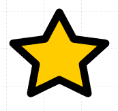 |
| sharp | 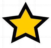 |
| flat | 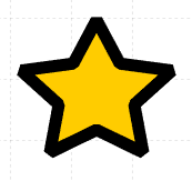 |