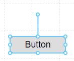
Button
A standard Button control that is used for capturing user clicks and triggering an event.
Properties
| Property | Type | Description |
|---|---|---|
| Text | Text Options | Text to display on the Button |
| Icon | Icon Options | Optional Icon to display on either side of the Button Text |
| Font | Font | Font style used for the Button Text |
| FG Color | Color | Foreground Text color |
| BG Color | Color | Background color behind the Text |
| Border | Border | Optional border around the Component |
| Enabled | Boolan | Enables or disables the item - only used to control when the Click event is active |
| Visibility | Boolean | Determines when to show or hide the Component |
| Flash | Boolean | Causes the Component to flash, drawing attention to it |
| Click | Event | Handles a click event |
Text Options
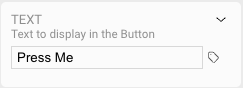
The text that is displayed on the button can be statically set via the Text panel. Alternatively, you can set the value of the button to reflect a dynamic Tag value.
Icon Options
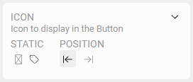
Click the icon to assign a static or default icon, or click the icon to assign one or more OAS Tags to select which icon is displayed. When you click an icon, the Icon Browser will be presented for you to choose which icon and style you would like to use.
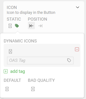
Dynamic Icons
You can position the Button's icon to the left or right of the Text by clicking the or icons.
When using a dynamic icon driven by OAS Tags, the same cascading logic is followed when assigning dynamic colors. Icons can also be assigned based on Tag data quality and when no Tag evaluates to true.