Input Field
A text input field that can be tailored for different data types.
Properties
| Property | Type | Description |
|---|---|---|
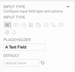
| Input Type | Input Options | Sets the type of field and default settings for the field |
| Font | Font | Font style used for the field |
| FG Color | Color | Foreground text color |
| BG Color | Color | Background or fill color behind the text |
| Border | Border | Optional border around the Component |
| Enabled | Boolan | Enables or disables the item - only used to control when the Change event is active |
| Visibility | Boolean | Determines when to show or hide the Component |
| Change | Event | Handles the event if the field text is changed |
Input Type
WARNING
When using a Tag-driven value for the input field, be sure the Input Type matches the expected value or it will not be displayed. For example, using a numeric input field for a string or boolean Tag value will not display the live data. This is also important if you set a value for Bad Quality. If the Bad Quality value does not match the input type, it will not display. In this case, use another property (e.g. background color), or other Component to indicate bad quality for that Tag.
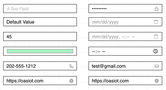
Text Input
A standard text input field that accepts any text input.
Numeric Input
A numeric input field that will only accept numeric and decimal point characters.
Password / Hidden Input
A text input that hides the display of the input, suitable for passwords or secure information.
Date Picker
A date picker control that only allows numerals in a date format, and provides a browser based calender picker.
Date / Time Picker
A combined date / time picker which formats the input and provides a browser based date and time picker.
Time Picker
A time picker that formats the value in time format and provides a browser based time picker.
Phone Number Input
A text input that shows a phone icon, to suggest to the user that a phone number value is preferred.
Email Input
A text input that shows an email icon, to suggest to the user that an email address value is preferred. This field provides browser validation for the user to indicate when an email address does not match a valid format.
URL Input
A text input that shows a globe icon, to suggest to the user that a Internet URL value is preferred. The field provides browser validation for the user to indicate that a web url is in an incorrect format.
Color Picker
The color picker allows a user to select a color from the standard web browser color picker.