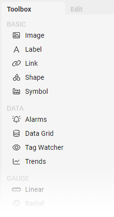
Component Toolbox
While in Edit Mode, the right-hand side bar will display the Component Toolbox and Component Editor tabs. The Editor will only be populated when a single Component is selected.
The Toolbox is a list of available Components, grouped by function, that can be placed onto a Screen. Clicking on the Component name will add a new instance in the upper-left of the current Screen and will select it.
BASIC - Simple Components such as Images, Labels, Shapes, Links, and Symbols
DATA - Complex Components that are used to visualize multiple data points or data sets
GAUGE - Rich visual Components that simulate physical gauges and meters to display numerical data
INPUT - Components designed for capturing user input in forms or control panels
MISC - Assorted Components for UI enhancements
Component Editor
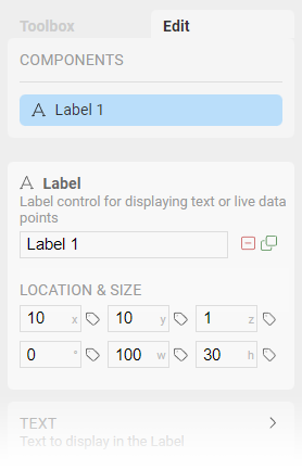
When a Component is selected on the Screen, the Editor will be populated with all settings available to modify. At the top of the Editor tab is a section labeled Components which lists all Components on the current Screen. This list is a convenient way of selecting a particular Component to edit without locating it on the Screen itself. This is often useful when Components overlap and it is difficult to directly click on the one you need.
Below the Components list is a common section shared by all types of Components. This contains the type and description of the Component, and an editable name for this instance. Naming Components is a good way of keeping track of them when your layout becomes complex.
Next to the name field are icons to Delete or Duplicate the selected Component.
Within the common section are also settings for positioning, sizing, and rotation. You can manually enter values for each, and even dynamically drive these values with OAS numeric Tags.