Breadcrumb
Displays a dynamic menu based on Screen hierarchy, allowing users to navigate between screens.
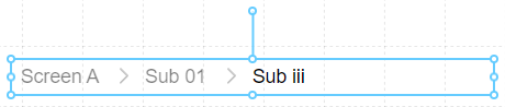
The Breadcrumb is a unique Component that is almost entirely driven by the structure of the Screen hierarchy. Placing the Breadcrumb on a Screen will automatically display the current Screen name and the path used to reach the Screen, split with a separator icon. Each Screen name is a link to that screen.
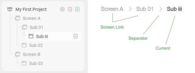
Hovering over the separator icon will display a menu of all child Screens, so the Breadcrumb will allow you to navigate through the entire Screen hierarchy.

TIP
To get achieve an effect of the Breadcrumb persisting over all Screens, be sure to place it on every Screen in the same location, and with the same settings.
Properties
| Property | Type | Description |
|---|---|---|
| Options | Breadcrumb Options | Choose how Breadcrumb separators are rendered |
| Font | Font | The font and style used for all text in the Breadcrumb |
| Text Color | Color | The color of unselected text |
| Current Font | Font | The font and style used to highlight the currently selected Screen in the Breadcrumb |
| Current Color | Color | The color of the selected Screen |
| BG Color | Color | Background or fill color behind the component |
| Border | Border | Optional border around the Component |
| Visibility | Boolean | Determines when to show or hide the Component |
Breadcrumb Options
Choose the icon you would like to use as a separator between Screen names.