Image
Image components are used for displaying static or dynamic images on a Screen.
Properties
| Property | Type | Description |
|---|---|---|
| Image | Image Options | Properties for controlling how the image scales, repeats, and aligns within the dimensions of the Component |
| BG Color | Color | Background color behind the selected image |
| Border | Border | Border around the image |
| Enabled | Boolean | Enables or disables the item - only used to control when the Click event is active |
| Visibility | Boolean | Determines when to show or hide the Component |
| Flash | Boolean | Causes the Component to flash, drawing attention to it |
| Click | Event | Handles a click event allowing you to use the image as a button |
Image Options
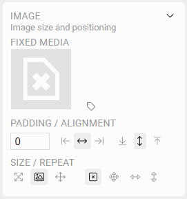
Fixed Media
Clicking on the image will set the static or default image to display in the Component. This will show the Media Browser allowing you to select or even upload a file to the server.
Read more about using the Media Browser
TIP
To speed up importing media, you can also drag an image from another browser window onto a Screen while in Edit Mode and the Media Browser will open for you to select where the image will be uploaded. Then after selecting the directory, a new Image Component will be added using that image.
NOTE: only users with Admin privileges can import new media or modify existing media.
Dynamic Media
Sometimes, its helpful to show a different image on the screen depending on real time OAS Tag values. Click the icon to assign OAS Tags to drive this logic.
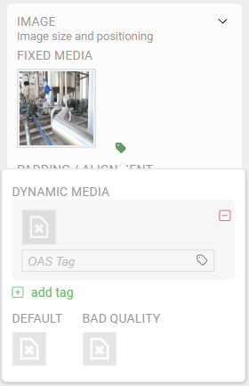
To define different images to display in the component:
- Click the image icon above the
OAS Tagfield, and browse to select the image you want to display - Use the Tag Browser to select a tag to monitor. Note: You may only select tags that can be interpreted as a Boolean value, such as true and false, or 0 and 1
- Click the "not equals" option if you would like the image to show when the tag is not true
TIP
The image displayed will follow cascading logic, allowing you to use multiple OAS Tags to determine which image is displayed.
You can assign a Default image to be displayed if none of the tags are currently true. Likewise, a Bad Quality image can be specified if any of the associated Tags report back a "Bad Quality" indication.
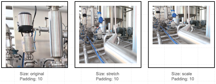
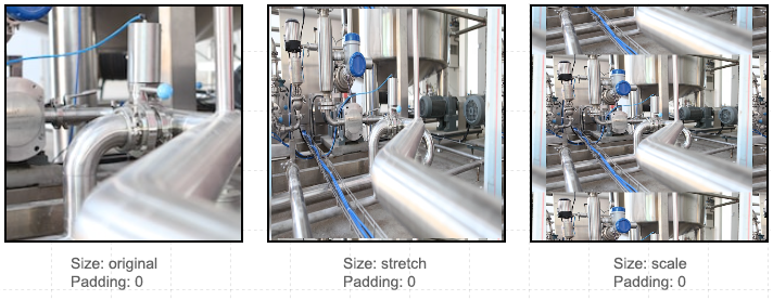
Padding
Because a Component can be sized to be smaller or larger than the underlying image, you can add padding around the image that is relative to the outer bounds of the Component. Depending how you've chosen to size and align the image, the padding will display differently:
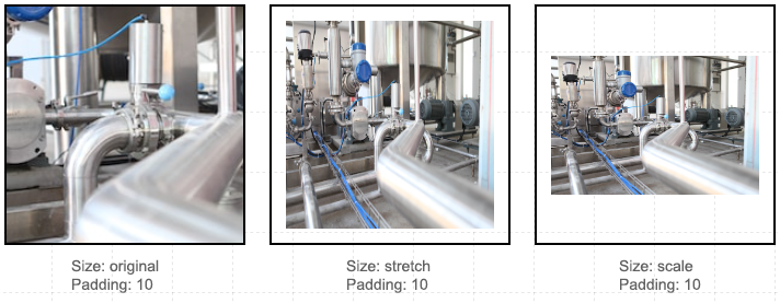
In the example above, the image is center-aligned both vertically and horizontally. If the original image is larger than the Component, no padding will be added. When you stretch the image, it fills all of the available space in the Component and in both dimensions, and the padding will be seen. When you scale the image, the original aspect ratio is retained, and the padding will be applied wherever the image dimension reaches the bounds for that dimension.
Alignment
Images can also be aligned within the Component bounds. In the example above all three instances are aligned both at the top and left . As you can see, when using the image original scale, if it is larger than the component, it will be aligned to the edge of the Component, and padding will affect the offset from the bounds. When you stretch the image, alignment has no effect. When you scale the image, alignment will only affect the dimension where there is additional room to adjust the image position.
Repeat
In some cases you may want to repeat an image. This is especially effective if the image is a seamless pattern. The example above illustrates the effect of repeating an image in both directions using all of the sizing options. Additionally, you can choose to only repeat the image horizontally or vertically .