Switch(Multi)
A customizable multi-position switch allowing users to pick from a static or dynamic list of values.
Properties
| Property | Type | Description |
|---|---|---|
| Options | Content | Configures the switch type and values |
| Label Font | Font | Font style used for the text on the switch |
| FG Color | Color | Foreground / primary color of the switch |
| Secondary Color | Color | Secondary color of the switch, if it supports a second color |
| BG Color | Color | Background or fill color behind the switch |
| Selected Color | Color | Foreground color for the selected switch option |
| Selected BG olor | Color | Background color for the selected switch option |
| Border | Border | Optional border around the component |
| Enabled | Boolan | Enables or disables the item - only used to control when the Change event is active |
| Visibility | Boolean | Determines when to show or hide the component |
| Change | Event | Handles the event when the switch value changes |
Options
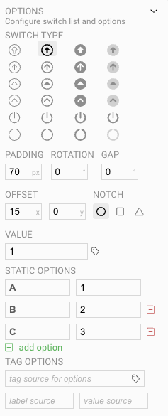
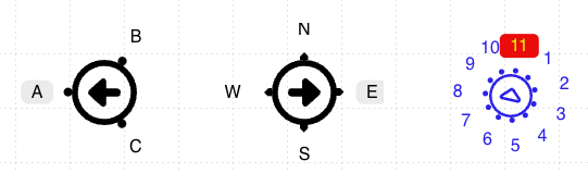
Similar to the simple Switch there are a number of visual options you can choose from when creating the switch. But with a multi-switch, you will add multiple options as possible switch values, rather than just a simple "on" or "off" value.
Display Settings
- Padding sets the space around the switch glyph, which can be used to fine-tune the placement of the switch options.
- Rotation sets the inital rotation of the switch. Usually the first option is on the far-left side, but changing the rotation will rotate where the starting option is displayed on the symbol.
- The Gap setting allows you to set a gap on the dial to allow for advance layouts, by leaving empty space on the dial
- Offset controls the x and y center of where the switch body renders within the control.
- The Notch setting allows you to select the graphical style of the notch at the intervals on the switch.
Value Settings
- Value indicates the initial value of the control when first loaded.
- Static Options lists the set of fixed options available for the switch. The left column indicates the visual value shown to the user, and the right column shows what value will be applied to the control.
- Tag Options work like other controls where visible options are displayed based on server tag values. See Tag Binding - Complex Values for more information.