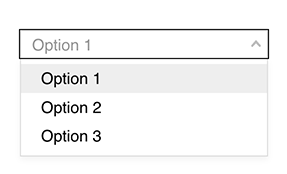
Combo Box
A standard combo box / dropdown style input. Similar to a check list or radio list, it provides a single selection input that can have an event attached.
Properties
| Property | Type | Description |
|---|---|---|
| Options | Content | Sets the available entries and tag assignments |
| Font | Font | Font style used for the option entries |
| FG Color | Color | Foreground text color |
| BG Color | Color | Background or fill color behind the combo box |
| Option Color | Color | Background text color for a selected option |
| Border | Border | Optional border around the Component |
| Enabled | Boolan | Enables or disables the item - only used to control when the Change event is active |
| Visibility | Boolean | Determines when to show or hide the Component |
| Change | Event | Handles the event when the combo box selection is changed |