Symbol
Symbols are scalable images that represent various objects or terms in a specific industry. For example, electrical schematic symbols might represent a complex electrical grid. These symbols are designed to help speed development of complex industry specific interfaces.
Properties
| Property | Type | Description |
|---|---|---|
| Symbol | Symbol | Use the Media Browser to choose a symbol to display |
| Stroke Color | Color | Color of the symbol outline |
| Stroke Width | Numeric | Width of the symbol outline |
| Shadow Color | Color | Color of the shadow accents that give some symbols depth |
| Fill Color | Color | Color of the fill within the body of the symbol |
| BG Color | Color | Background or fill color behind the component |
| Border | Border | Optional border around the Component |
| Enabled | Boolan | Enables or disables the item - only used to control when the Click event is active |
| Visibility | Boolean | Determines when to show or hide the Component |
| Flash | Boolean | Causes the Component to flash, drawing attention to it |
| Click | Event | Handles a click event |
Symbol
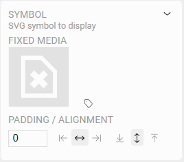
Fixed Media
Clicking on the symbol will set the static or default symbol to display in the Component. This will show the Media Browser allowing you to select or even upload a file to the server.
Read more about using the Media Browser
Dynamic Media
Sometimes, its helpful to show a different symbol on the screen depending on real time OAS Tag values. Click the icon to assign OAS Tags to drive this logic.
This configuration is identical to the Dynamic Media settings on an Image Component, using SVG symbols instead of bitmap images.
TIP
Any SVG file can be used as a symbol, allowing for infinite scaling without losing resolution. However, only SVG symbols provided with the UIEngine can have their fill, stroke, and shadow properties controlled by the application.
UIEngine Symbols contain several controllable layers such as Stroke, Shadow, Fill, and Solid.
For more information on how you can create your own SVG symbols that can be controlled by the UIEngine Coming Soon
Padding
You can add padding around the image that is relative to the outer bounds of the Component. This is especially useful if you are setting the Symbol background color and would like it to appear around the edge of the Symbol.
Alignment
Symbols can also be aligned within the Component bounds both vertically and horizontally.
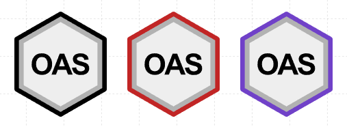
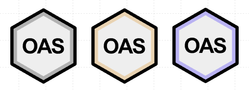
Stroke Color
Sets the color of the stroke or outline layer on the Symbol.
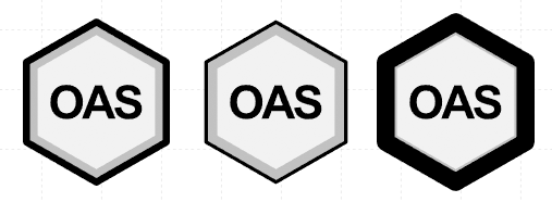
Stroke Width
Sets the relative width of the stroke or outline layer on the Symbol. The stroke, along with other layers will scale proportionally when the Component is resized.
Shadow Color
Sets the color of the semi-transparent accent shadow layer on the Symbol. Since the shadow layer is not opaque, the resulting color will be affected by the fill color. If the shadow color is neutral (e.g. black, white, or gray), the shadow will appear as a darker or lighter version of the fill layer color.
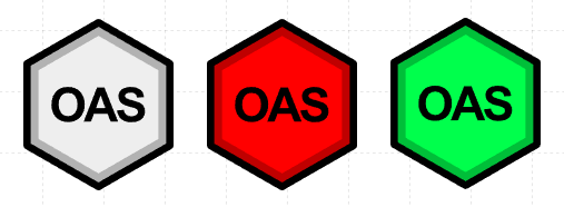
Fill Color
Sets the color of the fill layer on the Symbol.