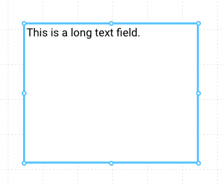
Text Field
Provides a large text area input field, useful for longer text inputs.
Properties
| Property | Type | Description |
|---|---|---|
| Text | Text Options | Text to display in the text input |
| Font | Font | Font style used for the control |
| FG Color | Color | Foreground Text color |
| BG Color | Color | Background color behind the input |
| Border | Border | Border around the control |
| Enabled | Boolan | Enables or disables the item - only used to control when the Change event is active |
| Visibility | Boolean | Determines when to show or hide the control |
| Change | Event | Handles a change event |
Text Options
The Text Options allows the user to set two values:
- The initial value of the text area
- A placeholder that gives the user helpful instructions about which type of data should be entered
And like every control, the text area value can be linked to a server Tag. See Tag Binding for more information.